Bringing the hotel industry into the digital world
Designing a beautiful and intuitive digital solution for hotel check-in
CLIENT
Concept Project
TIMELINE
2 weeks
SERVICES
App design

CHALLENGE
Design a digital solution for guest check-in.
Keep in mind:
Delight guests with a great experience
Emerge as a leader in the hospitality space
Utilize technology to bring the industry into the digital world
SOLUTION
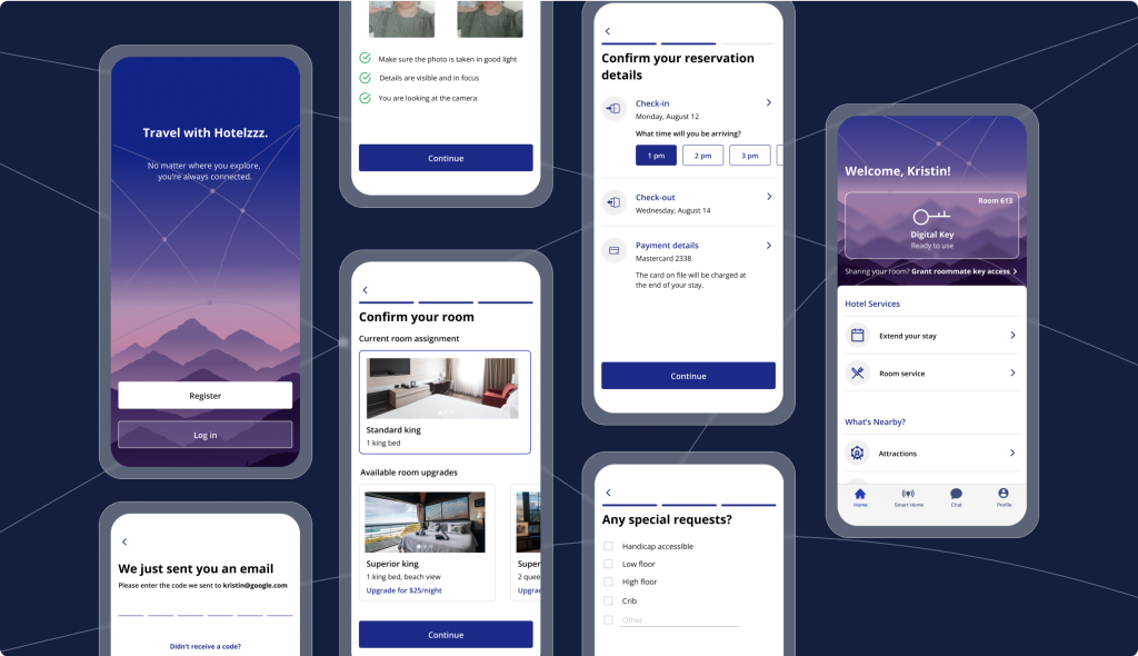
I completed a thorough research-based iPhone app design that provides an intuitive, beautiful, and smooth check-in experience targeted to the hotel chain’s main users.
RESULT
While this design was just a concept, I would have measured key KPIs such as check-in duration, customer satisfaction ratings, check-in inquiries, and room upgrades.
Problem Definition
Who am I designing for?
Who is traveling in 2021?
What problems does this solve?
What are the potential pain points?
Why does this matter?
How will this impact a hotel guest’s overall satisfaction?
Research Goals

Learn about my potential user
Who would actually want or use a product like this?
What are their pain points, needs, wants, and goals?
To what extent do demographics, and purpose of travel play a role?
Understand current solutions the and competitive landscape
What products and methods (digital and physical) exist today for checking into hotels?
Who are the direct or indirect competitors?
What works well, and what could be improved in the current landscape?
What type of digital solution is desired, and what makes the most sense?
Native app?
Website?
Digital kiosk?
Determine if and how we can leverage new technology and innovation...
Not just for the sake of implementing cutting-edge tech, but to actually improve the user experience (simplify tasks, delight, reduce friction and manual work, etc.)
Secondary Research Findings
Who is traveling now?
- Digital nomads: Since Covid-19, over a third of travelers have considered booking stays in order to work from a different destination (aka take a workcation), and over half of travelers would extend their stays to add leisure time to a business trip
- Over the last 2 years, searches for the word “workcation” increased 5,600%!
Data from Booking.com and Exploding Topics
How do travelers relate to technology?
- A mobile phone is the number one travel accessory among travelers
- Over 70% of US travelers agree that they “always” use their smartphones when traveling, up from 41% in 2015
- Travelers most frequently use their mobile devices to:
- Research activities or attractions
- Locate shopping areas and restaurants
- Look up directions
Data from Think with Google
What does the current market research say about contactless check-in?
- Keyless entry leads to an average increase of 7% in guest satisfaction scores
- Guest satisfaction scores drop by 50% when there’s a 5-minute wait at check-in
46% of travelers say a mobile key solution is an important on-property feature for them - 49% of travelers say “their hotel selection is influenced by high-tech features in the hotel room, i.e., mobile key.”
Data from Hotel Tech Report
Competitive Analysis
- Check in up to 2 days before stay
- Mobile key provides access to various hotel amenities
- Sends notification when room is ready
- Offers additional info about amenities, etc.
- Mobile chat
- The reservation must have been booked directly through an official Marriott channel
- Requires a Marriott Bonvoy account
- Some users report lack of consistency between app inputs and front desk experience (ex: room preference)
- Provides push-notification when it’s time to check in
- Guests still need to pick up a physical room key at the front desk
- If the guest doesn’t have a credit card on file, she will need to pay at the front desk
- Allows users to choose their room
- Users can use a digital key
- Guests need to be Hilton Honors members to use Contactless Arrival
- Some users report tech issues, in some cases where the hotel had no record of their stay, even while they were currently checked in!
Primary Research Findings
I had time for a few phone interviews (more like conversations), but most of my data collection came from surveying users via Google Forms.
I posted the survey in WhatsApp and Slack groups and shared with friends and former classmates asking for feedback. I tried to keep my questions open-ended, except when collecting basic demographic information.
Response breakdown:
10 responses
30% male
70% female
Ages 22-31
60% remote
10% in-person
30% hybrid

Key Qualitative Insights
Emphasis on immediate entry
“After traveling for hours, it’s nice to be greeted by a clean, prepared room and just crash”
Unawareness of contactless check-in
70% of users had never used contactless check-in
Require easy access to support
“What if the room is not what I requested? Who can I turn to?”
How will we measure success?
Check-in duration
Does it save time compared to in-person check-in?
Customer satisfaction
How does the customer satisfaction compare to in-person experiences?
Staff inquiries
How many inquiries does the hotel staff receive related to helping guests check in digitally or use their digital keys?
Room upgrades
How often does a guest upgrade their room upon checking in, digitally vs. in-person?
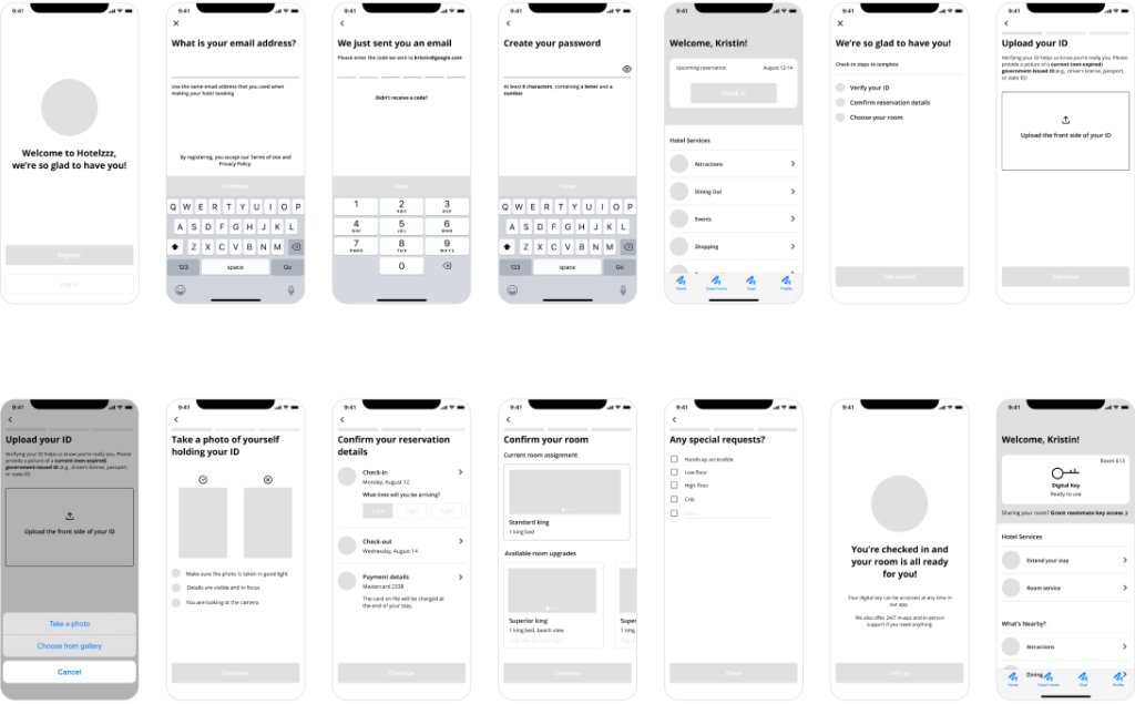
User Flow

