designing a mobile app
kadima
Framework: Designlab’s UX Academy
Timeline: 4 weeks
My Role: UX Design
Tools: Figma, Invision
THE PROBLEM:
Perched atop a plateau in the Judean mountains between the Mediterranean and Dead Sea, modern-day Jerusalem is a sprawling modern city built upon thousands of years of existing infrastructure. Tourists and residents commonly navigate the busy city streets by foot, yet this can be a complicated endeavor for those who have difficulty walking due to motor disabilities.
THE SOLUTION:
Develop branding and design an app to help people with motor disabilities find accessible routes that would help them arrive at their destinations.
"Kadima's design clearly shows that Sara understood the problem. I love the solution she came up with. Thank you for thinking of a solution to solve a very important goal!"
– David, potential user (wheelchair user)
STEP ONE
RESEARCH
Goal: To identify demographics, trends and goals of the accessible navigation industry and to learn more about Kadima’s target market
Process: Market Research, Competitive Analysis, Interviews
Research Goals:
To identify and define Kadima’s target user
To determine the Kadima’s users’ needs, motivations, and frustrations
To learn about competitor accessible navigation apps
To learn about accessibility features in mobile applications
Methodologies:
• Market research: To gain a better understanding and analyze trends of the accessible navigation industry and Kadima’s target market
• Competitive analysis: To identify and analyze Kadima’s direct and indirect competitors
• User interviews: Meet with wheelchair-users and gain insight into their experiences, as well as to answer any questions not covered by secondary research.
Market Research
I began my project by researching the accessible navigation industry and its trends and challenges, as well as demographic information about residents of Israel who have physical disabilities. This gave me valuable insight as to the needs and frustrations of the users I would be designing for, as well as a greater understanding of Kadima’s business strategy. Below are some notable findings from my market research:
Over three-fourths (77%) of smartphone owners regularly use navigation apps.
Over one-third (36%) of smartphone owners use navigation apps prior to leaving their location; 34% use them en route, and 30% use them both prior to leaving and en route equally.
Reasons people use their favorite navigation app:
Clear directions (25%)
Preferred features (20%)
User-friendly design/interface (20%)
Best directions for non-drivers (17%)
Never used another navigation app (14%)
Apps meant for specific modes of transportation (Transit and Lanespotter apps are particularly popular in the Northeast US, where car ownership is at a lower rate than the rest of the country)
Social features (reporting road conditions on Waze)
Carpooling
Utilizing data from satellite and aerial imagery
Curb ramps:
Running slope should not exceed 8.33%
Level landing should be provided at the top
Sidewalks:
Width should be greater than 915mm
Cross slope should not exceed 2%
Street furniture, plantings, and other fixed items should not protrude into travel routes
704,300 people of working age (18-67) in Israel have a disability
The most prevalent type of disability is physical disabilities (17.5%)
Gender distribution is about equal
Percentage of people with disabilities increases with age
People with disabilities have lower employment rates, satisfaction with housing arrangements, and general feelings of good health than the rest of the population
Clear, adaptable layout and design
Easy-to-follow navigation
Descriptive UI element labels
Alternative text or descriptions for media
Sound and video control
Keyboard control
Help with errors
Automate data collection
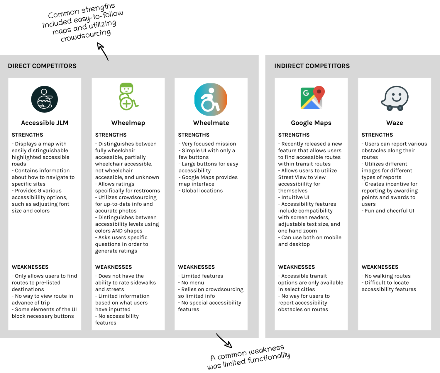
COMPETITIVE ANALYSIS
Based on my initial research I found that the most popular navigation apps weren’t necessarily the most useful for pedestrians with motor disabilities. I therefore conducted a Competitive Analysis to gain a greater understanding of apps that directly target users with motor disabilities, as well as the most popular general navigation apps.
user interviews
To learn more about Kadima’s target users I conducted 5 in-person interviews with young professionals in Jerusalem who use wheelchairs some or all of the time that they get around. I asked them open-ended questions to obtain a deeper understanding of their needs, motivations, and frustrations surrounding navigating Jerusalem in their wheelchairs.
STEP TWO
DEFINE
Goal: To synthesize and analyze research findings
Process: Empathy Map, User Persona, Point of View Statements and How Might We Questions
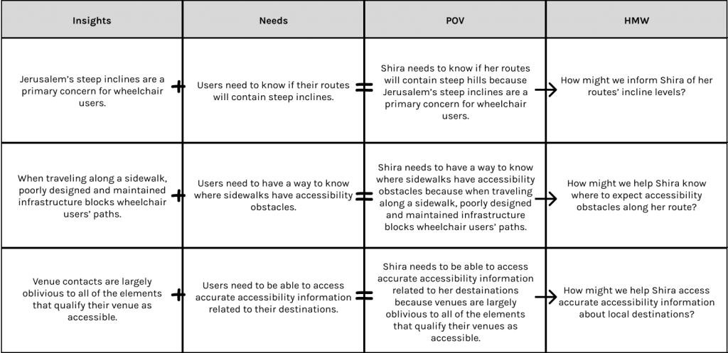
EMPATHY MAP
To synthesize my findings from my interviews, I transcribed all my data and organized them into groups so that I could observe the common patterns and determine their insights and needs.
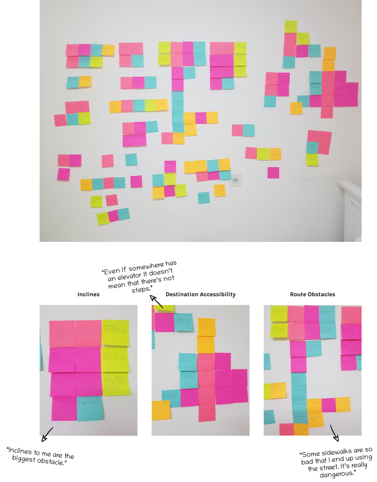
Insights
Jerusalem’s steep inclines are a primary concern for wheelchair users.
When traveling along a sidewalk, poorly designed and maintained infrastructure blocks wheelchair users’ paths.
Venue contacts are largely oblivious to all of the elements that qualify their venue as accessible.
Needs
Users need to know if their routes will contain steep inclines.
Users need to have a way to know where sidewalks have accessibility obstacles.
Users need to be able to access accurate accessibility information related to their destinations.
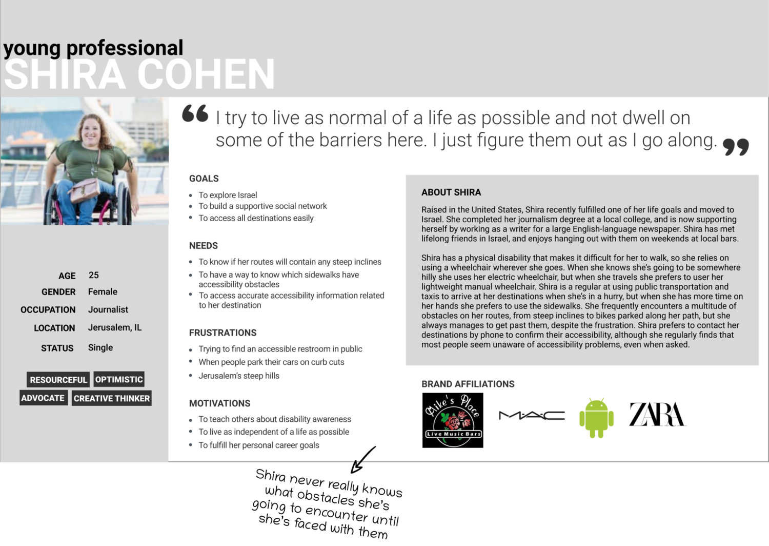
USER PERSONA
Based on my user research I crafted a user persona, personifying one of Kadima’s main target markets: the Young Professional. Shira embodied the independence that I discovered among Kadima’s target users, as well as the determination to navigate Jerusalem despite its accessibility obstacles. By creating Shira, I was able to reference her goals, needs, frustrations, and motivations so that I could better empathize with users during my design process.
POINT OF VIEW STATEMENTS & HOW MIGHT WE QUESTIONS
After defining my target user, Shira, I moved on to translating my insights and needs to frame Shira’s point of view so that I can define the problems I am going to solve for. I then translated these point of view statements into “how might we questions…?” so that I can begin the ideation process.
STEP THREE
IDEATE
Goal: To brainstorm potential solutions, organization of content, and flows
Process: Brainstorm, Product Roadmap, Sitemap, Task Flow, User Flow
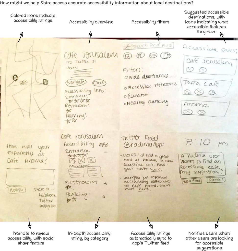
BRAINSTORM
In order to generate some extra solutions that would address Shira’s needs, I implemented the “Crazy 8’s” brainstorm method for each HMW question. This brainstorming exercise gave me the opportunity to generate creative ideas and challenge myself to visualize how they could be implemented. Click here to view the brainstorming exercise for each HMW question.
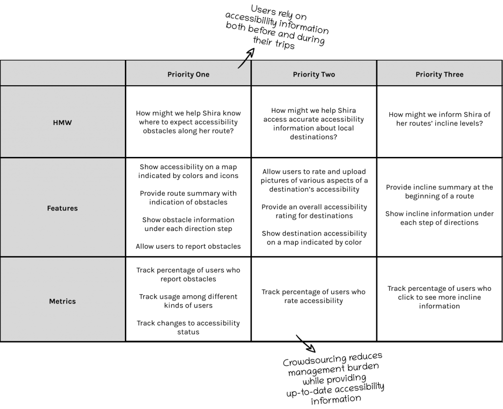
PRODUCT ROADMAP
After generating lots of of great solutions to my HMW questions, I then narrowed down those solutions and chose the features that would best address each question, taking into consideration practicality and impact on my users. The roadmap helped me to focus on features that would solve for Shira’s needs.
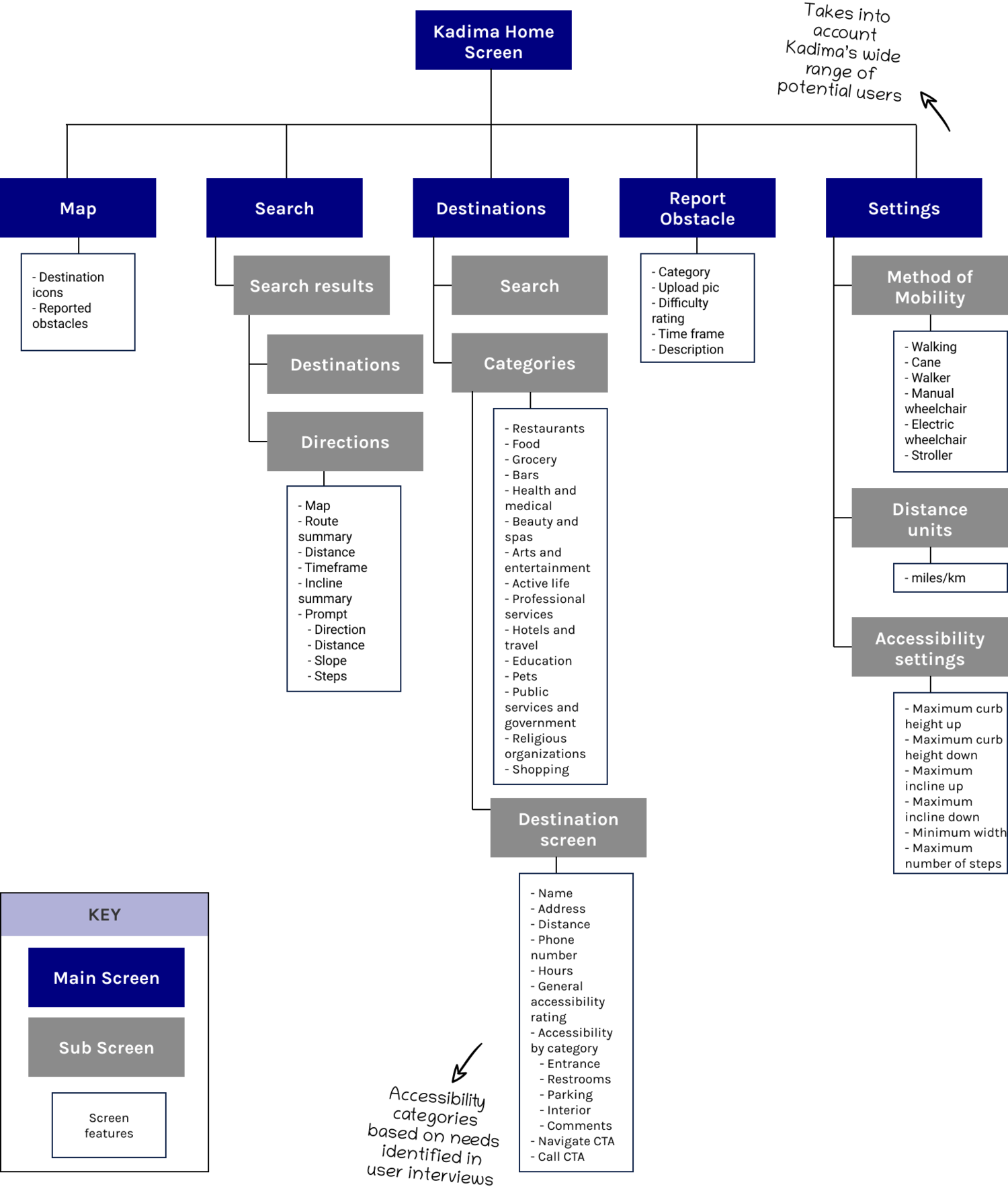
application MAP
To help me better understand how the new features would be organized, I created an application map outlining Kadima’s infrastructure.
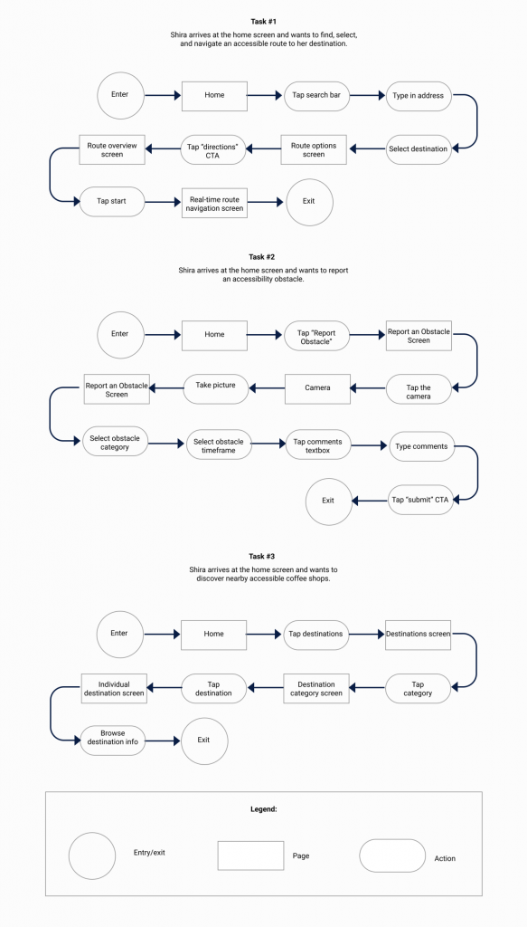
TASK FLOWS
To demonstrate how Shira would interact with the new features, I created four task flows based on scenarios that I uncovered during my research. Creating the task flows helped me visualize the user experience, and to ensure that it was as usable and straightforward as possible.
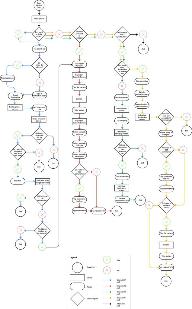
USER FLOWS
To further analyze how Shira would utilize my new features, I created a user flow to portray all potential paths she could take to completing her task. This allowed me to understand how the screens and features should be organized based on their relationships with other screens, as well as to optimize Shira’s user journey to be as clear and efficient as possible.
The four paths follow the following scenarios:
Shira is planning her route to a new doctor in her neighborhood. She wants to make sure that she finds a timely way to arrive with the least amount of obstacles, so she checks the Kadima app to find all available routes and to select the route that best fits her needs. She then follows this route until she arrives to her destination.
Shira is on her way to grocery shop at her neighborhood convenience store, when she notices that someone parked their car directly blocking the sidewalk curb cut that she needs to cross. In order to help other wheelchair users avoid the same obstacle, Shira reports the obstacle on the Kadima app.
Shira’s friend is visiting Jerusalem and they want to find a nice coffee shop to meet up at. Shira checks the Kadima app to find coffee shops in her area that are accessible based on her needs.
Shira called ahead to check a local government office’s accessibility, and was told that they are wheelchair accessible. When Shira arrived, though, she was disappointed to see that they actually have a single step in the lobby of the building that the government contact didn’t notice. Shira uses the Kadima app to rate the office’s accessibility so that other wheelchair users can be aware.
STEP FOUR
DESIGN
Goal: To design Kadima’s user interface
Process: Sketches, Mid-Fidelity Wireframes
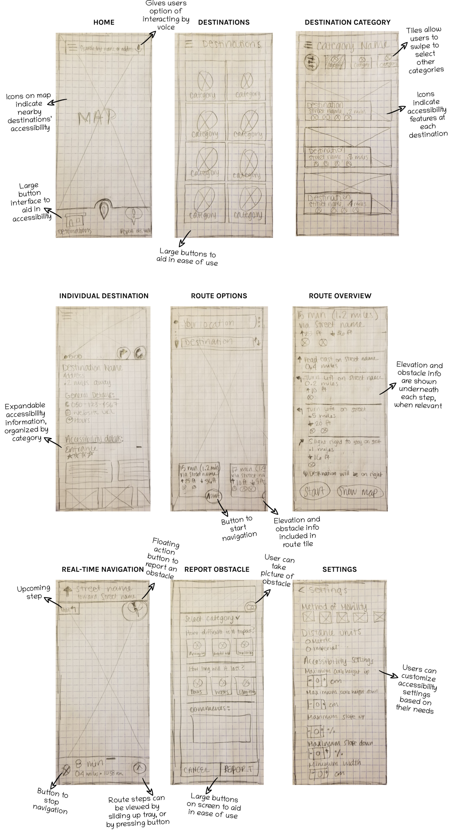
SKETCHES
To begin the design process, I sketched out how I envisioned my features would be designed within the app. I took inspiration from popular navigation apps, while paying close attention to ensuring accessibility throughout the designs.
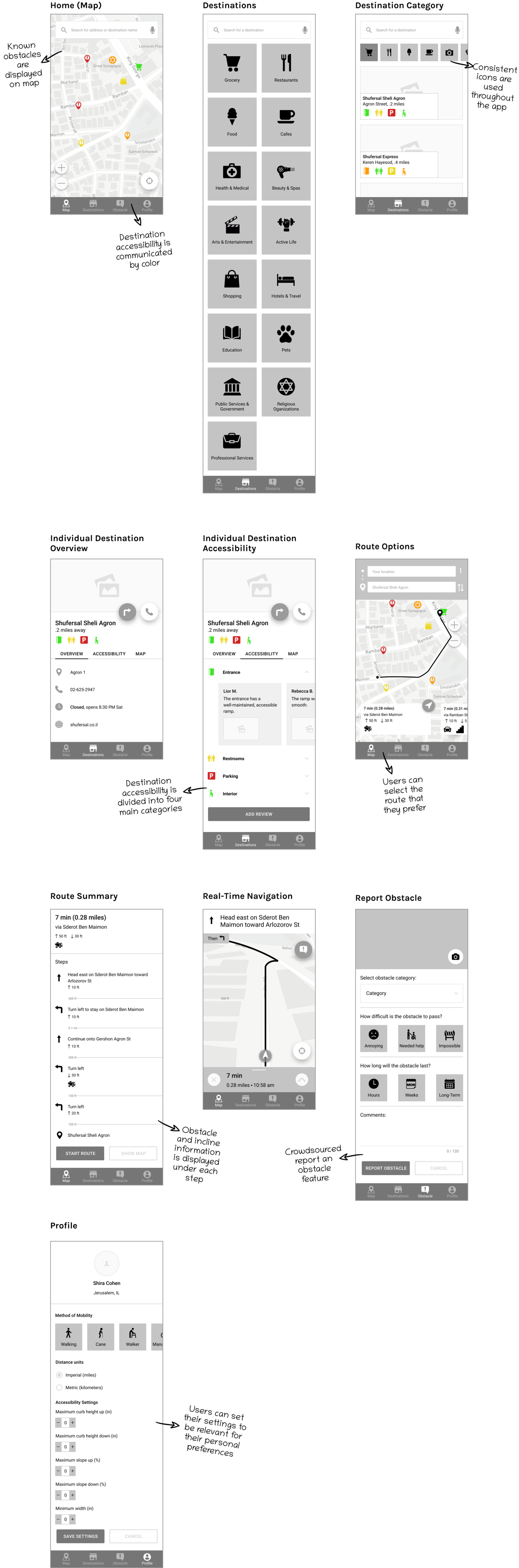
WIREFRAMES
As I went along the design process, I continued to fine-tune my designs to take into account what would best meet user needs, taking into account Material Design guidelines. Most notably, I adjusted the app’s navigation system to only utilize a bottom navigation bar, rather than additionally containing a navigation drawer.
STEP FIVE
prototype
Goal: To prototype Kadima and to obtain feedback based on usability testing
Process: Mid-Fidelity Prototype, Usability Testing
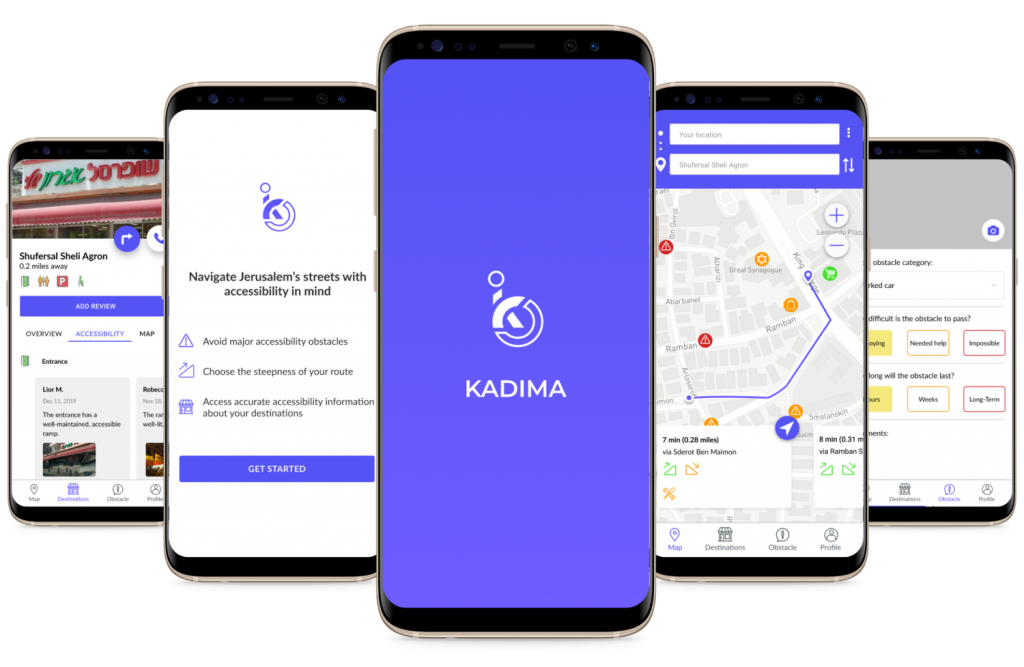
mid-fidelity prototype
In order to see how users interact with the app, I created a functioning mid-fidelity prototype using Figma and InVision. This allowed me to begin to test the usability of Kadima’s features.
USABILITY TESTING
To determine the ease of use of Kadima, I conducted in-person usability tests using my mid-fidelity prototype on 5 wheelchair-users in a similar age category as my persona, Shira. I was able to gather insightful feedback based on observation of my target users. It is only when my designs have been validated and improved based on user testing that I can say I truly accomplished my goal.
Objectives:
- Observe how users navigate throughout the app and complete their tasks
- Determine if users seem to easily be able to complete their tasks
- Identify areas of the prototype that seem to cause confusion and need improvement
User Tasks:
Find a nearby grocery store that has a wheelchair-accessible entrance.
Write a review rating your experience with Shufersal’s entrance as positive.
Find the shortest route to Shufersal Sheli Agron and follow the directions to navigate to your destination.
Confirm the construction that you encounter on your route.
Report a parked car as an obstacle.
STEP SIX
ITERATE
Goal: To update my designs based on common patterns found in usability testing
Process: Affinity Map, Branding, High-Fidelity Prototype, UI Kit
AFFINITY MAP & REvisions
My usability testing revealed a few key findings. I organized the trends, themes, and areas of opportunity for discovery and improvement based on usability testing on the Affinity Map.
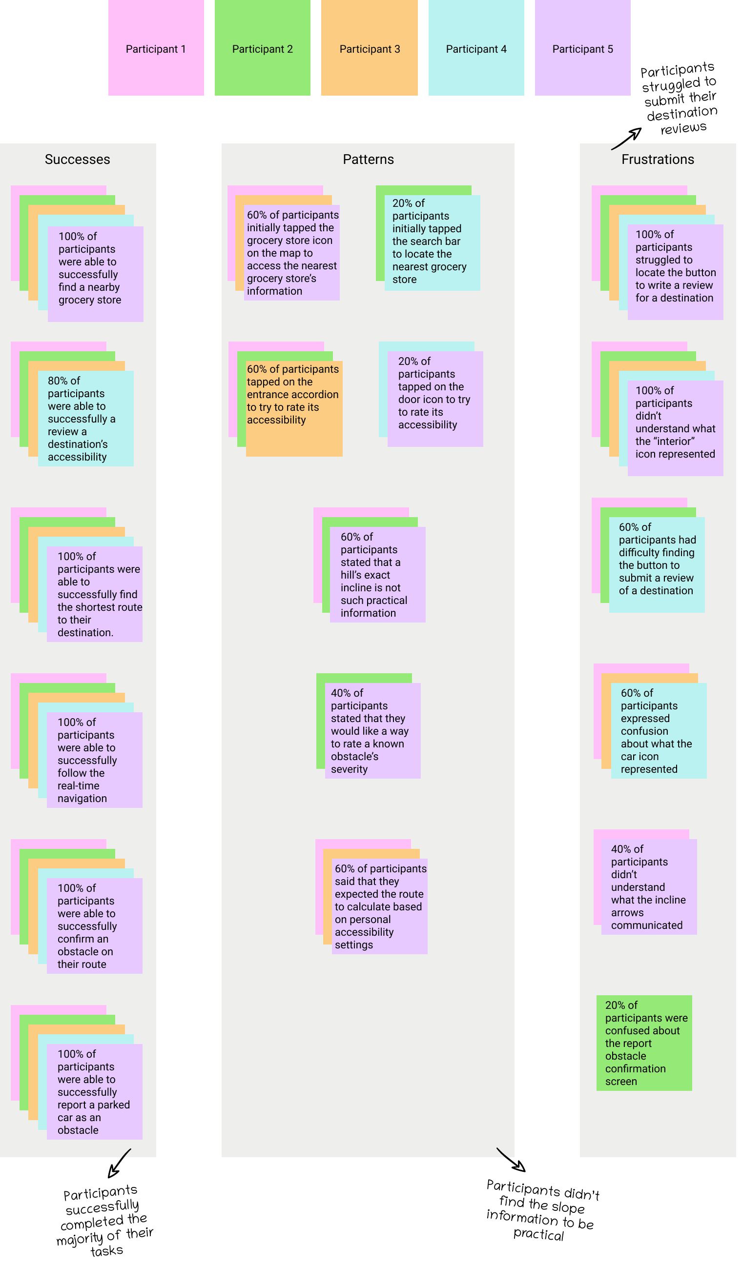
Based on this feedback, I established four main insights and recommendations
Insights
Users didn’t find the incline information helpful.
Users expected to only be shown routes relevant to their accessibility settings.
Users had difficulty in finding the button to submit their reviews.
Users had difficulty locating the button to submit a review of a destination’s accessibility.
Recommendations
Rate inclines by difficulty level, indicated by a colored sloped arrow.
Only present options that are accessible based on user settings (e.g., no stairs at all for wheelchair users).
Add color to highlight the button’s location.
Move the “add a review” button to the top of the accessibility tab.
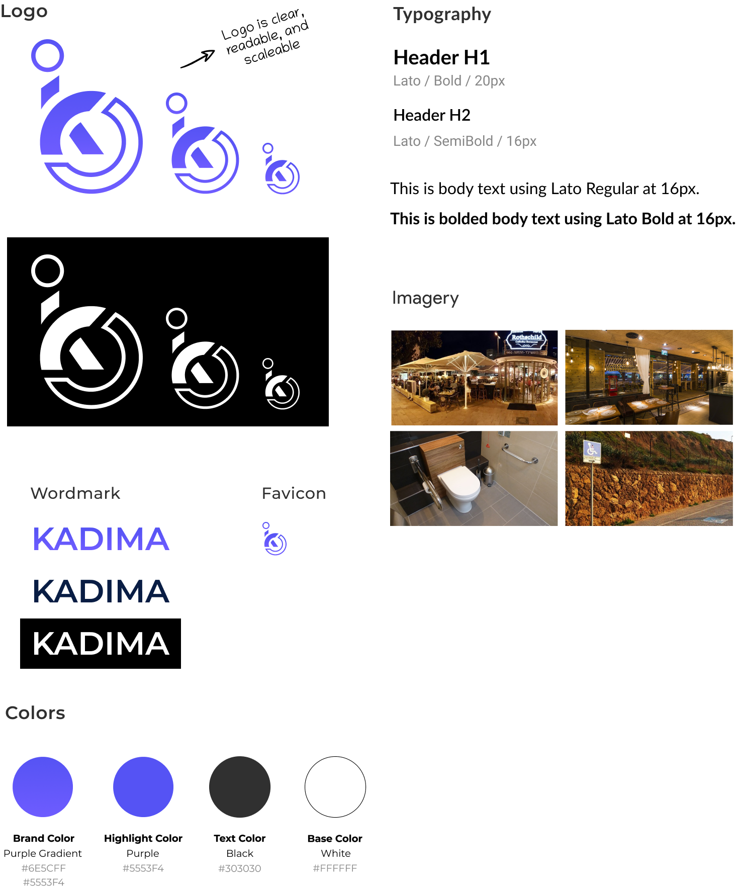
branding
Before creating high-fidelity wireframes, I first defined Kadima’s branding to ensure its cohesiveness with its brand attributes: welcoming, accessible, reliable, and encouraging.
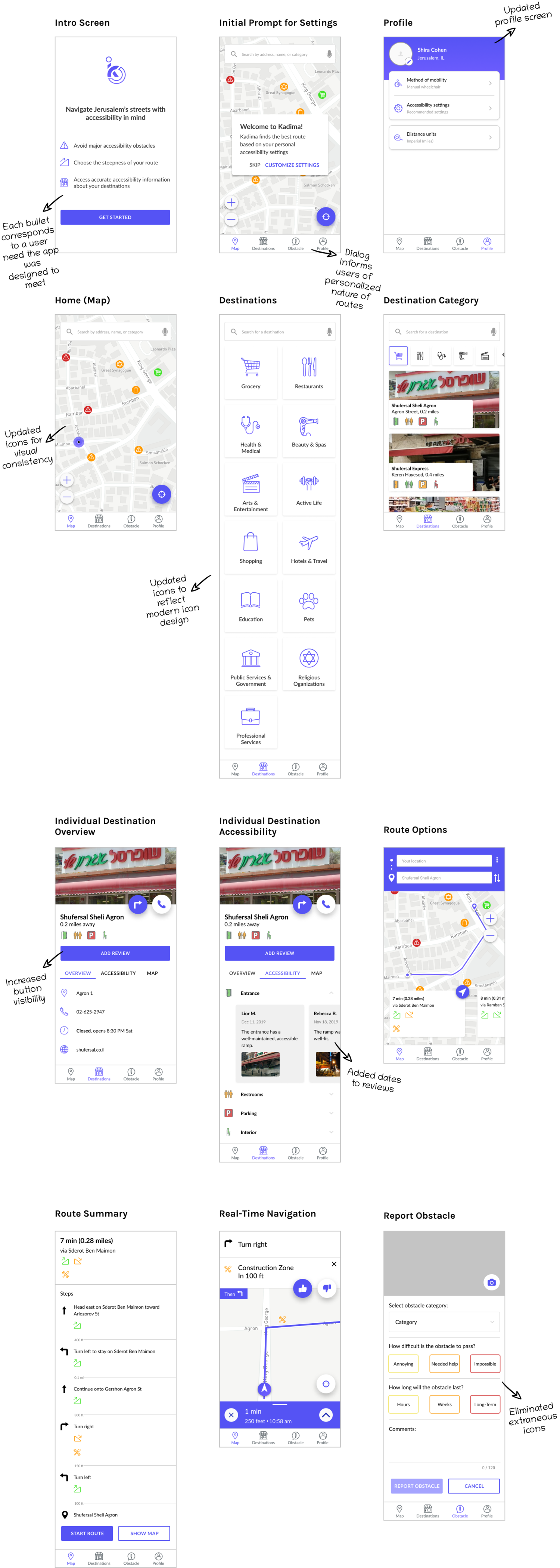
revised high-fidelity prototype and wireframes
I made the revisions based on the recommendations in my Affinity Map, and compiled them in a revised high-fidelity prototype. Interact with the prototype and view my revisions below.
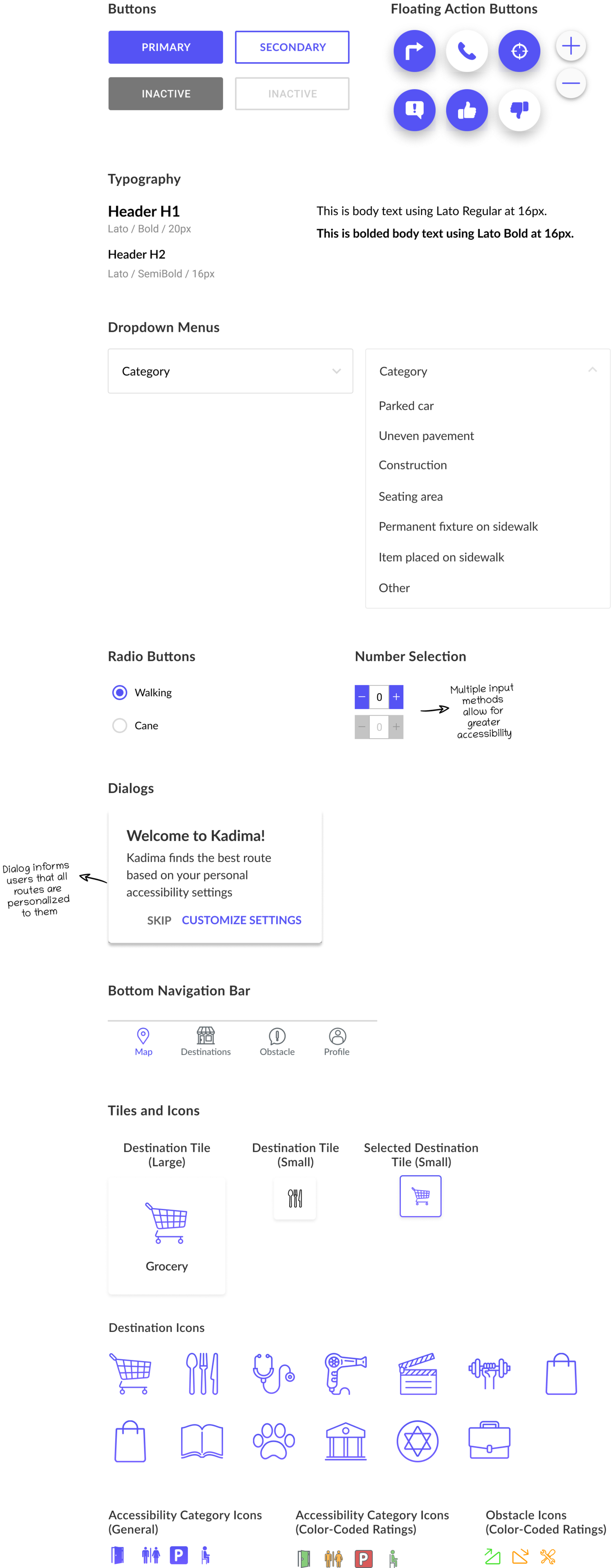
ui kit
As I was creating my wireframes, I maintained a UI Kit for my reference so that I could ensure that all elements were consistent. A section of Kadima’s UI Kit is pictured below, and the full UI Kit can be seen here.
reflection & next steps
Next Steps
Continue building out additional screens
Continue iterating based on additional testing to either confirm or improve the revisions I made, and begin collecting metrics regarding engagement of new features.
Hand off designs to developers, discuss logistics of implementation, and determine any other technical limitations.
Update UI Kit as needed
Final Thoughts
The most challenging aspect of this project was reminding myself that this product was meant to create an MVP that would meet user needs, rather than getting carried away and introducing extra features.
In the future, I would love to explore the concept of gamification so that users would be entertained and motivated to contribute. I’d also love to work on additional accessibility features, such as ways to indicate obstacle intensity in ways other than just color, and further developing the element of voice interaction.
It was incredibly rewarding to design an app that solved a real user problem, and iterating on it to ensure that user needs where truly met. I really enjoyed the process of empathizing with users, and getting to the core of their problems and needs.